Design effective school displays: practical steps for engagement
TL;DR:
- Purpose-driven, visually accessible, and regularly updated displays enhance student engagement and communication.
- Interactive elements like QR codes and touchscreens increase participation and provide valuable usage data.
- Schools should treat display design as an ongoing process, regularly auditing and refreshing content.
Many school displays fail to engage students because they are cluttered, visually confusing, or simply outdated. A bulletin board packed with overlapping flyers, faded printouts, and irrelevant information does more harm than good. It signals disorganization and gets ignored. The good news is that effective display design is not a mystery. With clear objectives, thoughtful visual choices, and the right tools, your school’s displays can become powerful communication assets. This article walks through four practical steps to help administrators and educators create displays that genuinely connect with students, support learning, and keep your community informed.
Table of Contents
- Define purpose and core objectives
- Ready your design elements: Visual clarity and accessibility
- Embed interactive features to spark participation
- Update and monitor displays for lasting impact
- Why display design is more than decoration: Our perspective
- Take action with DST Connect solutions
- Frequently asked questions
Key Takeaways
| Point | Details |
|---|---|
| Purpose-driven design | Successful displays focus on clear goals, not just decoration. |
| Visual clarity matters | Legible fonts, high contrast, and uncluttered layouts boost engagement. |
| Interactivity increases participation | Including interactive elements like QR codes and touchscreens gets students involved. |
| Update displays regularly | Keeping displays current with refreshed content maintains their effectiveness. |
| Inclusivity is essential | Design with accessibility in mind to ensure all students benefit from displays. |
Define purpose and core objectives
Every effective display starts with a clear purpose. Before choosing fonts or colors, ask yourself: what is this display supposed to do? School displays generally serve one of three functions. They showcase student work to build pride and ownership. They share information such as schedules, policies, or announcements. Or they celebrate achievements to recognize effort and growth. Mixing all three without a plan typically produces a cluttered, unfocused result that students walk right past.
Purposeful displays improve learning and engagement by giving students something relevant to connect with. A display designed around a specific goal, whether that is explaining a math concept, recognizing a student of the week, or promoting an upcoming event, is far easier to read and remember than a general-purpose collage of information.
The following table illustrates the key differences between three common display types:
| Display type | Primary goal | Typical content | Success measure |
|---|---|---|---|
| Decorative | Aesthetic appeal | Seasonal art, classroom themes | Visual appeal rating |
| Informative | Share key information | Schedules, rules, announcements | Information retention |
| Participatory | Student involvement | Work samples, prompts, polls | Active student engagement |
Each type requires a different design approach. A decorative display values visual harmony. An informative display prioritizes clarity and structure. A participatory display needs open space, prompts, and easy-to-change content areas.
Core objectives to set before designing any display:
- Identify the single primary audience (all students, specific grade, parents)
- Define one main message or theme the display should communicate
- Set a measurable outcome, such as improved quiz scores or higher foot traffic near the display
- Determine how frequently content will need to change
- Confirm alignment with current curriculum topics or school values
“Displays should honor student effort, show growth, and reflect the diversity of the school community. Curriculum-connected content always outperforms generic decoration when it comes to student engagement.” Displaying student work reinforces this principle, noting that students respond more positively to seeing their own learning reflected on walls.
Pro Tip: Before you start designing, write a one-sentence objective for each display. For example: “This display will show students their reading progress and motivate them to reach the next level.” If you cannot write that sentence, the display needs more planning. You can also explore integrating digital signage into your school’s display strategy for more dynamic and goal-driven content management.
Now that we see the importance of purposeful displays, let’s prepare the visual design elements.
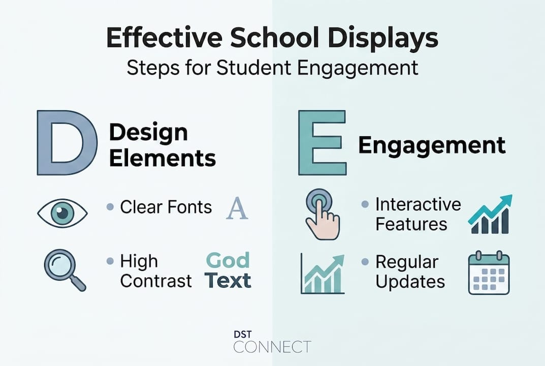
Ready your design elements: Visual clarity and accessibility
Once you have a clear purpose, the next challenge is translating it into a design that students can actually read and absorb. Visual clarity is not optional. It is the foundation of any effective display. Students should be able to understand the key message within a few seconds, from a normal viewing distance.
Large, legible fonts and high-contrast colors ensure readability from a distance and reduce the effort students need to engage with your content. A general rule: use sans-serif fonts at least 24 to 36 points for body text, and even larger for headlines. Avoid decorative or script fonts for anything more than a short title. Black text on a white or light yellow background remains one of the most readable combinations available.

Color matters more than most educators realize. Calming colors like blue and green support focus and reduce overstimulation, while bright clashing tones can increase anxiety and distraction, especially for students with sensory sensitivities. This is not about making displays boring. It is about using color strategically so that important information stands out without overwhelming the viewer.
The following table shows how wall space usage affects student behavior and learning outcomes:
| Wall space coverage | Student focus level | Visual overload risk | Recommended for |
|---|---|---|---|
| Less than 20% | Low stimulation | Very low | Calming, minimal environments |
| 20 to 50% (optimal) | High focus | Low | Most classroom settings |
| 50 to 70% | Moderate distraction | Moderate | Use sparingly, rotate content |
| Over 70% | Significant distraction | High | Not recommended |
Accessibility requirements for school displays:
- Use a minimum 4.5:1 contrast ratio for text against background colors
- Position interactive or touchable content at wheelchair-accessible height (roughly 15 to 48 inches from the floor)
- Avoid flashing or rapidly cycling animations for students with epilepsy or ADHD
- Use clear, simple language and include images to support non-readers or English language learners
- Avoid placing critical information in areas with heavy glare or poor lighting
Accessibility and inclusivity in digital signage require high contrast, proper positioning for wheelchair users, and avoiding sensory overload for students with ADHD or autism spectrum conditions. These are not optional extras. They are baseline requirements for any school environment.
Pro Tip: Limit yourself to two or three colors per display. Choose one dominant background color, one accent color for headings or borders, and one neutral for body text. This restraint creates visual order and makes your content easier to process at a glance.
For more technical guidance on making your displays as readable as possible, the team at DST Connect has outlined practical approaches to optimizing display readability that apply directly to school settings. You can also browse display template ideas designed for clarity and impact. With the visual groundwork laid, the next focus is on making displays interactive for deeper engagement.
Embed interactive features to spark participation
Static displays are easy to ignore. Adding interactive elements transforms a wall from background noise into an active learning tool. When students can touch, respond, or contribute to a display, their sense of ownership and attention increases significantly.
Interactive elements like QR codes, open questions, and touchscreens are proven to boost student participation. A QR code linking to a video explainer, a student survey, or a digital gallery gives students a reason to stop and engage. Touchscreens in hallways or common areas can host interactive quizzes, school maps, or daily schedules that students actually want to check.
Here is a step-by-step approach to embedding interactive features:
- Start with a QR code. Generate a free QR code using any online tool and link it to relevant content: a video, a form, a website, or a student portfolio. Print it clearly on the display with a short call to action like “Scan to see our project.”
- Add a response prompt. Include a simple open question on the display such as “What surprised you most this week?” and provide a way for students to respond, whether that is a sticky-note wall, a linked form, or a whiteboard section.
- Rotate student-generated content. Schedule a recurring slot in your display where student work, quotes, or creative pieces are featured. This creates anticipation and gives students a direct stake in the display.
- Install a touchscreen where possible. Common areas like libraries, reception, and cafeterias are ideal locations. Touchscreens can display schedules, announcements, and interactive content simultaneously.
- Track engagement. Use simple methods like checking QR code scan counts or form responses to measure how many students are interacting with the display.
Research consistently shows that 96% of students notice digital signage in their environment, making it one of the most effective passive communication channels available in schools.
Pro Tip: If touchscreens are not in the budget yet, start with a free digital feedback form linked through a QR code. It takes less than ten minutes to set up and gives you immediate insight into what students are thinking. This low-tech entry point often builds the case for larger investments later.
Interactive displays are not just engagement tools. They create data. Every scan, tap, and form response tells you something about how students are using the space and responding to content. Schools using interactive signage report that students are significantly more likely to act on information they encounter through a display they have interacted with, compared to a static poster they simply walked past. Even in settings like cafeterias, menu board interaction ideas show that real-time participation boosts attention and response rates.
After adding interactive strategies, it is critical to keep displays relevant and up to date.
Update and monitor displays for lasting impact
A display that was exciting in September can become invisible by November. Familiarity breeds inattention. Keeping content fresh is not just about aesthetics. It is about maintaining the signal value of your displays. Students and staff learn quickly to ignore information that never changes.
Regularly updating displays keeps content relevant and shows your school community that the information is current and worth reading. For digital signage, automation tools make this significantly easier, allowing administrators to schedule content rotations in advance without manual effort for each update.
Practical update methods include:
- Manual refresh: Assign a rotating student team or staff member to update physical displays on a bi-weekly schedule
- Scheduled automation: Use digital signage software to rotate content automatically based on time, date, or event triggers
- Student content rotation: Reserve a dedicated display section for student-submitted content, refreshed weekly or by class group
- Seasonal and curriculum alignment: Update displays to match current units of study, upcoming events, or school calendar milestones
- Feedback-based revision: Use student and staff input to determine which displays are working and which need improvement
“Limit visual clutter: Keep 20 to 50% of wall space clear,” because excessive decoration has been shown to reduce on-task behavior and reduce measurable learning gains across grade levels.
The following table summarizes strategies for maintaining display impact over time:
| Strategy | Frequency | Benefit | Tools needed |
|---|---|---|---|
| Content rotation | Weekly to bi-weekly | Maintains freshness | Staff time or CMS |
| Automation scheduling | Ongoing | Reduces admin workload | Digital signage software |
| Student contribution | Monthly | Increases ownership | Submission system |
| Feedback review | Quarterly | Identifies what works | Survey or observation |
| Curriculum alignment | Each unit or term | Increases relevance | Lesson planning calendar |
The Goldilocks effect in classroom design shows that approximately 25% wall coverage is the sweet spot for visual stimulation. Too little feels sparse and uninspiring. Too much creates cognitive overload. The goal is intentional, curated content that earns its place on the wall.
To track engagement, consider these practical monitoring practices. Walk the display area periodically and note whether students are stopping, reading, or interacting. Check QR code analytics monthly. Ask students directly during class whether they have noticed or used information from a specific display. For digital signage updates, many platforms provide built-in analytics dashboards that show content views and interaction rates. Combine these data points with qualitative observation to get a complete picture. For deeper content strategy guidance, explore signage content tips and the growing demand for digital signage in education to understand where the field is heading.
Why display design is more than decoration: Our perspective
Many schools treat wall displays as an afterthought, something to fill space or satisfy an inspection checklist. In our experience working with educational institutions, this mindset is one of the biggest barriers to creating genuinely engaging learning environments.
The evidence is clear. Displays that are purposeful, visually accessible, interactive, and regularly updated create measurable improvements in student engagement and communication. They reflect what a school actually values: student growth, community recognition, and inclusive communication. When a student sees their own work featured prominently, or finds useful information without having to ask a teacher, that display has done its job.
The schools that get this right share a common trait. They treat display design as an ongoing practice, not a one-time task. They audit their displays regularly and set specific improvement goals each quarter. They involve students in content creation and decision-making. And increasingly, they are turning to digital signage integration to manage content at scale without overwhelming their staff.
Pro Tip: Audit every display in your school once per quarter. Ask three questions: Is it current? Is it readable? Does it reflect student involvement? If any answer is no, that display needs attention before the next term begins.
Take action with DST Connect solutions
DST Connect gives schools the tools to move from static, outdated displays to dynamic, well-managed digital signage without requiring technical expertise. The platform’s drag-and-drop editor, scheduling features, and 600-plus professionally designed templates make it easy to create and update content across every screen in your building. Whether you are managing a single classroom display or a network of hallway screens, DST Connect scales to fit your needs.
Here is how to get started:
- Access digital signage training through DST Academy, designed specifically for educators and administrators who want to build their skills and implement signage confidently
- Explore digital signage hardware options compatible with Android, Windows, and URL-based media players, ensuring flexible installation across any school environment
- Use DST Connect’s cloud-based dashboard to manage multiple screens from a single login, schedule content updates in advance, and monitor display performance without leaving your desk
Try DST Connect today and give your school displays the structure, clarity, and impact they deserve.
Frequently asked questions
How often should school displays be updated?
Displays should be refreshed at least every term, though bi-weekly updates for key information keep content relevant and maintain student attention over time.
What is the ideal wall coverage for classroom displays?
Research supporting the Goldilocks effect recommends approximately 25% wall coverage, which provides enough visual stimulation to engage students without causing cognitive overload.
How can displays be made more inclusive?
Inclusive display design requires high-contrast visuals, interactive elements positioned at wheelchair height, and content that avoids flashing or sensory overload for students with ADHD or autism.
What interactive features can be added to school displays?
QR codes, touchscreens, and linked digital feedback forms are highly effective and accessible options, with QR codes being the easiest starting point for schools with limited budgets.
Recommended
Enjoyed this blog?
Continue with the previous or next article and discover more ideas, insights and inspiration from DST Connect.